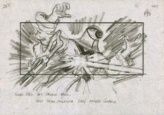
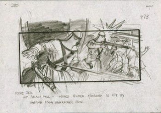
I have 4 more frames of the same scene in the larger format. When you look at them side by side, it's apparent that they're the same. Reducing the large work or scanning it on line art setting vs magazine setting will give you a different look. Line art scanning setting increases the width of lines, so the work appears different. Xeroxing -- dark fine line becomes thicker and darker, but very fine lines disappear. The work ends up looking different. Took me awhile to figure it out on the scanner. You'd think scanning drawn artwork the setting to use is line art, but no, it isn't. A more accurate representation is either photograph or magazine scanner settings.
Tuesday, May 5, 2015
Flash Gordon Storyboards by Mentor Huebner
FLASH GORDON storyboards - there was question as to who the artist was on the Flash Gordon Storyboards. Dino had given these to me years and years ago, saying, in that off-hand way he has, "Here, take these, you like them, these are from Mentor," so I always assumed they were his. Someone here pointed out the boards I was uploading may not be done by Mentor, and provided a link to a Flash Gordon site and Mentor's site indicating which work he did on Flash Gordon. I wondered if Dino was wrong, and let it go... Then I found 4 more boards -- the originals of these are very large, and in the bottom corner they have Mentor's signature. These are first generation production copies -- which means in the process of copying, their lines have been altered. Reduced, the charcoal marks become even thicker and rougher, but in their original scale, the work looks different. The first 2 of are one board, but was too large to fit on the scanner so are two jpgs. The 3rd is his signature and the 4 is a fax copy which was sent from the set to the office, reduced down to an 8x11.
Labels:
Dino DeLaurentis,
FLASH GORDON,
Mentor Huebner,
Storyboards
Subscribe to:
Post Comments (Atom)


No comments:
Post a Comment